The Challenge
A long-standing product with an old code base can over time become scattered and inconsistent when pieces built by different teams stop matching with each other. The same functional element can be realized in multiple different versions and the number of alternative components and styles becomes unmanageable.
Collaboration between developers and designers becomes difficult, as there is no single source of truth that dictates what the rules are. Time to market grows longer and longer, as simple visual updates can take a significant amount of effort.
The Process
01 · Audit and Inventory
The first step to create a unified experience was to examine the current state of the product to curate a list of colors, text styles, and components. The list has then been prioritized and a schedule advised.
02 · DEFINING COMPONENTS
In an incremental manner, the components have been designed, documented and tested within the actual usage context. Elements are defined to be reusable and adjustable, can be used consistently across the product.
03 · PAGES
The pages of the product were updated to consist only of the Design System components and styles. If the existing components have not proven adequate or sufficient, their design has been iteratively refined.
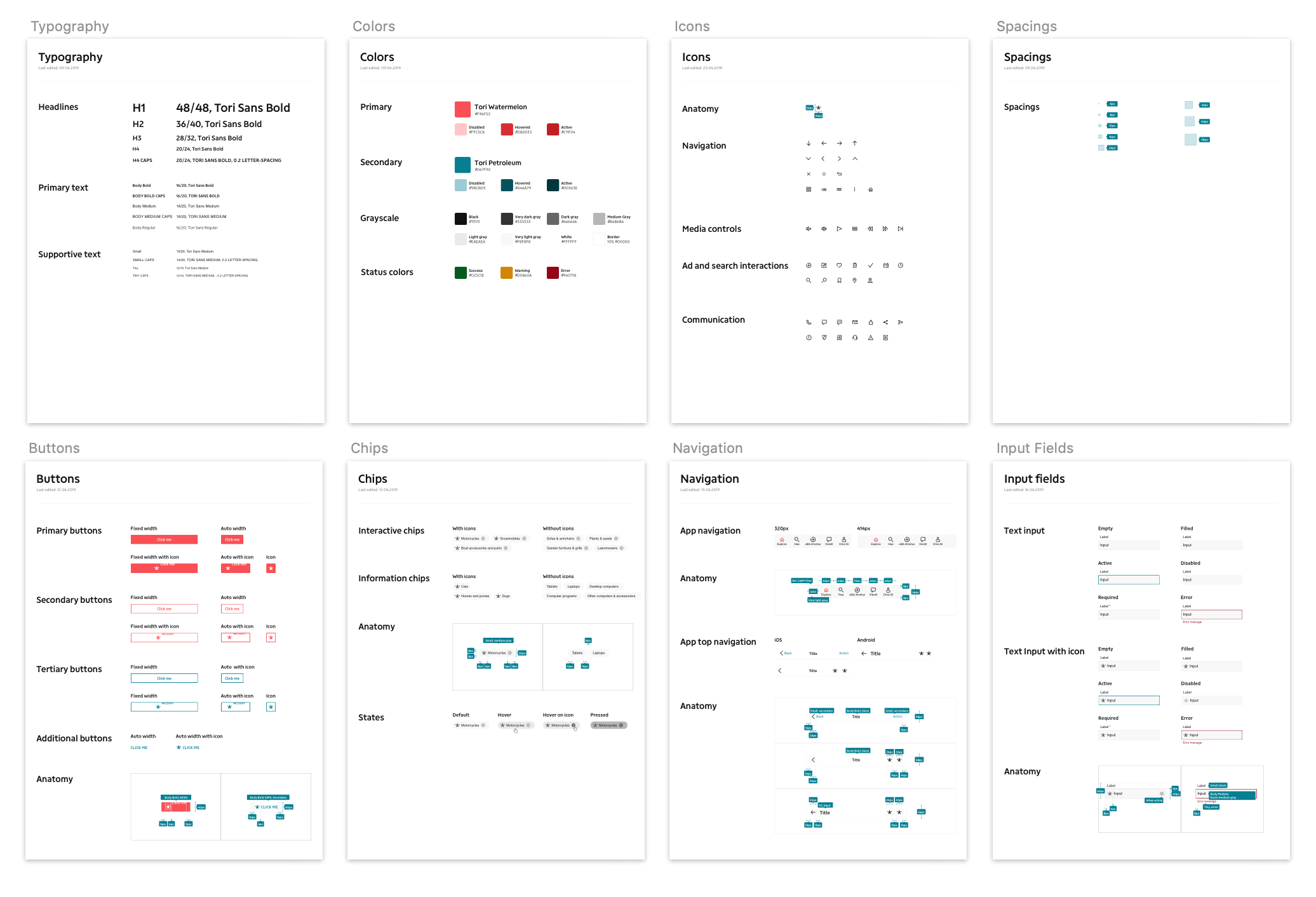
Specification
The team has put special attention to carefully construct the components in a way that is easily accessible and reusable by all designers in the organization. The symbols from the established Sketch library file are being joined with each new design file, so they can be easily updated when a new version of the Design System is released.
To ease the communication with developers, the documentation is inserted to Zeplin, a design handoff tool where developers can see all the parameters they need for the implementation: sizes, distances, and color codes.
Outcomes
The team is still in the process of renewing the product according to the new design documentation. Nevertheless, we can already see the benefits of the Design System in our work.
The time spent rebuilding the same components is reduced, update in one place propagates across the pages and platforms. Consisted and standardized components create a much more coherent look and feel. Designers focus on solving user problems. Developers focus on how things work, not how they look.